How to engage in pseudoscience with real data: A criticism of John Hattie’s arguments in Visible Learning from the perspective of a statistician
The work of John Hattie on education contains, seemingly, the most comprehensive synthesis of existing research in the field. Many consider his book, Visible Learning (Hattie, 2008), to be a Bible or a Holy Grail: “When this work was published, certain commentators described it as the Holy Grail of education, which is without a doubt not too much of a hyperbole” (Baillargeon, 2014, para. 13).
For those who are unaccustomed to dissecting numbers, such a synthesis does seem to represent a colossal and meticulous task, which in turn gives the impression of scientific validity. For a statistician familiar with the scientific method, from the elaboration of research questions to the interpretation of analyses, appearances, however, are not sufficient. According to the legend, the Holy Grail is kept in the elusive castle of the Fisher King. When taking the necessary in-depth look at Visible Learning with the eye of an expert, we find not a mighty castle but a fragile house of cards that quickly falls apart. This article offers a critical analysis of the methodology used by Hattie from the point of view of a statistician. We can spin stories from real data in an effort to communicate results to a wider audience, but these stories should not fall into the realm of fiction. We must therefore absolutely qualify Hattie’s methodology as pseudoscience. The researcher from New Zealand obviously has laudable intentions, which we describe first and foremost. Good intentions, nevertheless, do not prevent major errors in Visible Learning — errors which we will discuss afterwards. The analysis process then leads to a list of questions researchers should ask themselves when examining studies and enquiries based on data analyses, including meta-analyses. Afterwards, in an effort to better understand, we give concrete examples that demonstrate how Cohen’s d (Hattie’s measure of effect size) simply cannot be used as a universal measure of impact. Finally, to ensure that our quest does not remain unfinished, we offer pathways of solutions with the objective of demystifying and encouraging the correct usage of statistics in the field of education.
John Hattie’S INTENTIONS
The basic idea behind Hattie’s research, that is, to identify “what works best in education” using scientific data, is not bad in and of itself. The desire for rigor and concrete data is essential in order to describe the impact of measures on teaching and learning. Hattie draws from meta-analyses, which are relatively complex statistical methods frequently used in, among many other fields, medical and health research. The size of his synthesis appears impressive: over 800 meta-analyses, comprising over 50,000 studies and millions of individuals. Starting with over 135 effect sizes, it seems capable of measuring a wide array of interventions with the potential to improve learning. Hattie is not afraid of numbers, which is apparently not that common among researchers in the field of education; this therefore gives the appearance of scientific rigor to his work. Consequently, for a statistician, this seems like a very good start.
Unfortunately, in reading Visible Learning and subsequent work by Hattie and his team, anybody who is knowledgeable in statistical analysis is quickly disillusioned. Why? Because data cannot be collected in any which way nor analyzed or interpreted in any which way either. Yet, this summarizes the New Zealander’s actual methodology. To believe Hattie is to have a blind spot in one’s critical thinking when assessing scientific rigor. To promote his work is to unfortunately fall into the promotion of pseudoscience. Finally, to persist in defending Hattie after becoming aware of the serious critique of his methodology constitutes willful blindness.
Methodological errors
Fundamentally, Hattie’s method is not statistically sophisticated and can be summarized as calculating averages and standard deviations, the latter of which he does not really use. He uses bar graphs (no histograms) and is capable of using a formula that converts a correlation into Cohen’s d (which can be found in Borenstein, Hedges, Higgins, & Rothsten, 2009), without understanding the prerequisites for this type of conversion to become valid. He is guilty of many errors, but his main errors correspond to two of the three major errors in science cited by Allison, Brown, George, and Kaiser (2016) in Nature:
1. Miscalculation in meta-analyses
2. Inappropriate baseline comparisons
His most blatant calculation error is the case of the common language effects (CLE), which take the form of a probability. Noticed in 2012 by Norwegian researchers (Topphol, 2012), it is flagrant to the point of giving negative probabilities or probabilities superior to 100%. Hattie only had to put together a small table (see Table 1) to help the reader (and himself) see the relation between the effect size and CLE.
TABLE 1. Correspondence between selected values of Cohen’s d and CLE equivalents
|
d |
0.00 |
0.20 |
0.40 |
0.60 |
0.80 |
1.00 |
1.20 |
1.40 |
2.00 |
3.00 |
|
CLE |
50% |
56% |
61% |
66% |
71% |
76% |
80% |
84% |
92% |
98% |
To not notice the presence of negative probabilities is an enormous blunder to anyone who has taken at least one statistics course in their lives. Yet, this oversight is but the symptom of a total lack of scientific rigor, and the lesser of reasoning errors in Visible Learning. If Hattie had taken the trouble to consult with an experienced statistician, he would not have committed such a huge mistake. According to R. A. Fisher: “To consult the statistician after an experiment is finished is often merely to ask him to conduct a post mortem examination. He can perhaps say what the experiment died of” (Allison et al., 2016, p. 28). The other calculation errors are not so much numerical as they are related to inappropriate baseline comparisons and to the absence of methodological rigor. Hattie believes that we can compare effect sizes because Cohen’s d is a measure without a unit and gives examples of calculations:
These two types of effects are not equivalent and cannot be directly compared. We will come back to this later on. A statistician would already be asking many questions and would have an enormous doubt towards the entire methodology in Visible Learning and its derivatives.
Questions to ask
If there is a moral to the story of Perceval, or the Story of the Grail, Chrétien de Troyes’ unfinished novel, it is that we must not hesitate to ask questions. When confronted with any set of data, we must always know what is the main question to which we are seeking an answer. Relatedly, we must know which variables were measured and the way in which they were measured. What is the target population? How was the sample collected? With comparison groups, and especially when measuring an intervention, we must ask how individuals were allocated to different groups. If individuals were not randomly assigned to different groups, observed differences can result from the nature of the groups rather than the treatment or the intervention. Another important question is at which level were the variables measured (individual, group, school, provincial, national)? These questions enable us to understand what a study or a meta-analysis actually measured and in which context. Without knowing the exact context, it is easy to misinterpret results and these misinterpretations can sometimes have significant consequences. The disaster of the space shuttle Challenger is one example: the data selected to authorize the launch indicated an absence of a relation between temperature and the risk of an accident because cases without any incidents had been excluded from the data set (Kennet & Thyregod, 2006).
Hattie talks about success in learning, but within his meta-analyses, how do we measure success? An effect on grades is not the same as an effect on graduation rates. An effect on the perception of learning or on self-esteem is not necessarily linked to “academic success” and so on. A study with a short timespan will not measure the same thing as a study spanning a year or longer. And, of course, we cannot automatically extend observations based on elementary school students to secondary school or university students. The same applies to the way we group different factors under a category without defining inclusion and exclusion criteria. For example, the gender effect reported by Hattie is, in fact, a mean of differences between boys and girls in the set of studies selected, regardless of the duration, the level, or the populations studied.
A non-existent universal measure
Basically, Hattie computes averages that do not make any sense. A classic example of this type of average is: if my head is in the oven and my feet are in the freezer, on average, I’m comfortably warm. Another humoristic example is: the average person has one testicle and one ovary and thus is a hermaphrodite. We wouldn’t say that the person making this kind of statement holds the Holy Grail of biology research, yet this is exactly what Hattie does when he aggregates every gender difference under the same effect. This is also true for his other aggregations, whether they be “major” contribution sources (the student, the home, the school, the teacher, the programme, or the teaching method) or “individual” influences, such as the “disease” effect which combines together disparate health problems, including cancer, diabetes, sickle-cell anemia, and digestive problems. It goes without saying that certain of these individual influences are much less frequent than others.
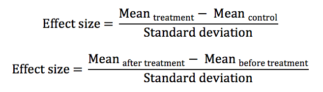
The fundamental problem here is that every effect size, despite the absence of a unit, is a relative measure that provides a comparison to a set, group, or baseline population, even if it may be implicit. To compare two independent groups is not the same as comparing grades before and after an intervention implemented with the same group. Hattie’s comparisons are arbitrary and he is completely unaware of it. The selection of a baseline comparison defines the direction (the positive or negative sign) of the effect size. In his “barometer,” Hattie says that negative effects are reverse effects, which is not necessarily the case since the comparison is often arbitrary. Would we say that the differences in academic success that benefit girls are bad, whereas those that benefit boys are good?
The effect of class size (under the “significant” bar according to Visible Learning, which is 0.4) is positive and we suppose that we are comparing small classes to larger classes (smaller classes have greater academic success). We could have compared larger classes to smaller ones, and the effect would have been negative (larger classes are less successful than smaller ones), and Hattie’s interpretation (class size does not have a significant impact) would be completely different, since a negative impact is considered to be harmful.
The same is true for socio-economic status. The effect size is large (0.59), but since Hattie cannot change the socio-economic status of students, he cares little about it. The implicit comparison is that wealthier students are more successful than poorer students. As such, the baseline comparison is comprised of poorer students. We could just as well compare poorer students to wealthier students and, because the disadvantaged are less successful, the socio-economic effect would be -0.59, the most negative of all, if nothing else is changed. Subsequently, it becomes of interest to study how an education system can help mitigate the effect of social inequalities, perhaps by drawing from examples from Finland where this approach seems successful, according to their PISA tests results (Reinikainen, 2012).
The other arbitrary decision is the creation of aggregates in order to calculate average effects. Here, in addition to mixing multiple and incompatible dimensions, Hattie confounds two distinct populations: 1) factors that influence academic success and 2) studies conducted on these factors. As an analogy, we could enumerate everything sold in a grocery store according to price and conclude that seafood products have the greatest impact on one’s overall grocery bill because the price of caviar is exorbitant. Obviously, since the average consumer rarely if ever, purchases caviar, a weighted approach to prices is needed in order to better reflect the actual products and the quantities purchased by the average consumer. Now, let’s go back to the example of gender and academic success. According to Hattie, the gender impact effect is 0.12 and therefore in favour of boys. If this number was representative of any sort of reality, this would mean that boys are on average a little more successful in school than girls. This is not the case in Quebec nor in most industrialized countries (Legewie & DiPrete, 2012).
Hattie’s interpretation of effects is therefore not in the least objective. As mentioned earlier, according to his quadrant, effects below zero are bad. Between 0 and 0.4 we go from “developmental” effects to “teacher” effects. Above 0.4 represents the desired effect zone. There is no justification for this classification. First of all, there is no reference point on a universal baseline to center his null effect and to talk about development. Can a person who is alone and without instruction learn by him/herself in a way that is measurable? If the effects due to teachers fall between 0.15 and 0.4, why is the impact of teachers’ knowledge of subject matter only at 0.09? Can we say that someone unlearns when the effect is negative? Does this mean that a person without sickle cell disease or who is born full-term has inherent knowledge since Hattie decided to put a positive effect on the absence of disease?
Finally, Hattie confounds correlation and causality when seeking to reduce everything to an effect size. Depending on the context, and on a case by case basis, it can be possible to go from a correlation to Cohen’s d (Borenstein et al., 2009):
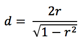
but we absolutely need to know in which mathematical space the data is located in order to go from one scale to another. This formula is extremely hazardous to use since it quickly explodes when correlations lean towards 1 and it also gives relatively strong effects for weak correlations. A correlation of .196 is sufficient to reach the zone of desired effect in Visible Learning. In a simple linear regression model, this translates to 3.85% of the variability explained by the model for 96.15% of the unexplained random noise, therefore a very weak impact in reality. It is with this formula that Hattie obtains, among others, his effect of creativity on academic success (Kim, 2005), which is in fact a correlation between IQ test results and creativity tests. It is also with correlations that he obtains the so-called effect of self-reported grades, the strongest effect in the original version of Visible Learning. However, this turns out to be a set of correlations between reported grades and actual grades, a set which does not measure whatsoever the increase of academic success between groups who use self-reported grades and groups who do not conduct this type of self-examination.
Example: three ways to calculate an effect size
There are multiple valid ways to analyze a given data set; each of these methods will illustrate a different aspect of the problem under study. For this reason, one must absolutely ensure that they are using the right scale and the same perspective when performing meta-analyses or computing effect size averages. We can consider the following example: four independent groups with identical normal distributions (with, for example, an average of 75 and a standard deviation of 5). The four groups are taught initially with the “standard” teaching method. For the next teaching module, each group is randomly assigned to one of three new teaching methods, labelled 1, 2, and 3, while one group continues with the standard method, labelled method 0. At the end of the module, the four groups pass an identical test and the results are compared to measure an effect size. Let’s suppose that the increase in grades follows a normal distribution and that, on average, method i increases individual grades from point i with a standard deviation of i. The grades of the control group do not change (actually, it can be seen as an increase of 0 with a standard deviation of 0).
Like Hattie, the three effect size formulas rank the teaching methods in order to identify the “best one.” To start, we can compare the experimental groups to the control group (a). Then, we can look at the before and after grades of each group (b), and finally, we can use a correlation between the before and after grades of each group and convert into Cohen’s d (c). The effect sizes are in Table 2.
Table 2. Comparison of the different methods used to calculate effect size
|
Group |
(a) |
(b) |
(c) |
|
Control |
0.00 |
N/A |
Infinity |
|
Method 1 |
0.14 |
1.00 |
10.00 |
|
Method 2 |
0.27 |
1.00 |
5.00 |
|
Method 3 |
0.39 |
1.00 |
3.33 |
According to the effect sizes measured by formula (a), method 3 is the best one and the only one that almost falls into the desired effect zone. Formula (b) leads us to believe that the three methods are equivalent (even if in fact, the real effect varies from one method to another), but all are very high in the desired effect zone. Finally, according to formula (c), the standard method is infinitely better than the others, and the order is completely reversed in comparison to formula (a). What is going on?
Formula (a) compares independent groups between themselves and subsequently includes noise due to group variability. We are trying to distinguish between the heavily overlapping four normal curves illustrated in Figure 1. Luckily, the groups were identical before the intervention and the teaching methods were randomly assigned. Thus, the measured effects are those of the teaching methods.
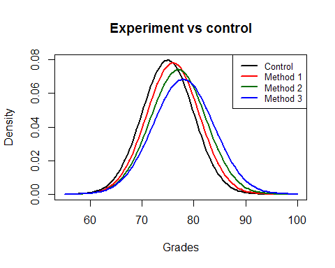
Figure 1. Grade distribution according to group
Since formula (b) measures grade increases within each group, we compare each group to itself, which in turn makes the source of noise disappear (the difference between groups). The measured effect is more “pure” but we lose the capacity to compare groups between themselves since the standard deviation changes from one group to another. By dividing the average increase by the standard deviation, we lose a dimension. Normal distribution curves of grade changes are represented in Figure 2. Although these curves are very different, the measured effects are identical.
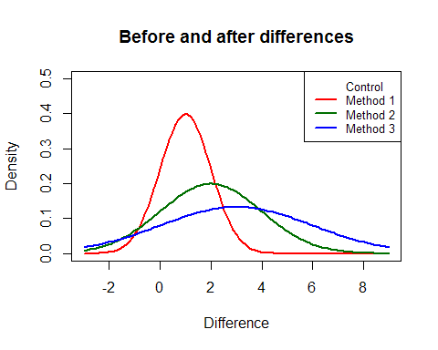
Figure 2. Distribution of differences between before and after grades according to group
Finally, as it is the case for many effects based on correlations, formula (c) does not measure increases in grades (the effect of the teaching method) but measures the noise surrounding this change. As the standard deviation of the increase in grades grows, the correlation weakens. Subsequently, the conversion into d results in a weaker effect for larger standard deviations (but enormous effects in comparison to formulas (a) and (b)).
Solution: Consult with a statistician
The examples above describe but a small fraction of the fundamental reasoning errors found in Visible Learning. We could spend ages dissecting each meta-analysis, evaluating to which extent there are calculation and interpretation errors, and describing the actual limits of the original analyses. There is also a lack of space to explain the complexity and subtleties of proper modeling of intervention effects calculated from different observational or experimental studies, including questions on dose-effect relationships, geographic locations, and time. All of this is completely lost when one decides to reduce everything to one single number, because it is insufficient to represent reality.
In summary, it is clear that John Hattie and his team have neither the knowledge nor the competencies required to conduct valid statistical analyses. No one should replicate this methodology because we must never accept pseudoscience. This is most unfortunate, since it is possible to do real science with data from hundreds of meta-analyses.
Statistics and modern data science offer an array of rigorous tools that allow for a better understanding of collected data and to extract useful and applicable conclusions. It goes without saying that the development of the education system must be analyzed in a scientific manner, and for this, the solution remains the same as the one proposed by Fisher many decades ago (cited in Allison et al., 2016): we must consult with a statistician before data collection. And during data collection. And after. But mostly, at each step of the study. We cannot allow ourselves to simply be impressed by the quantity of numbers and the sample sizes; we must be concerned with the quality of the study plan and the validity of collected data.
For this, we must call upon experienced statisticians who will know how to keep a watchful eye and to think critically. Every self-respecting university offers a statistics consultation service to support scientific research. It is also possible to obtain these services from private companies or consultants. There is no reason why faculties of education should not call upon such services. It is imperative to do so, because, as we have seen in Indiana Jones and the Last Crusade, the consequences of choosing the wrong Grail are tragic.
References
Allison, D. B., Brown, A. W., George, B. J. & Kaiser, K. A. (2016). Reproducibility: A tragedy of errors. Nature, 530, 27-29.
Baillargeon, N. (2014, 23 February). Visible learning [blogpost]. Retrieved from https://voir.ca/normand-baillargeon/2014/02/23/visible-learning/
Borenstein, M., Hedges, L., Higgins, J., & Rothstein, H. (2009). Introduction to meta-analysis. Hoboken, NJ: John Wiley & Sons.
Hattie, J. (2008). Visible learning: A synthesis of over 800 meta-analyses relating to achievement. London, United Kingdom: Routledge.
Kennet, R., & Thyregod, P. (2006). Aspects of statistical consulting not taught by academia. Statistica Neerlandica, 60(3), 396-411.
Kim, K. H. (2005). Can only intelligent people be creative? A meta-analysis. Prufrock Journal, 16(2-3), 57-66.
Legewie, J., & DiPrete, T. A. (2012). School context and the gender gap in educational achievement. American Sociological Review, 77(3), 463-485.
Reinikainen, P. (2012). Amazing PISA results in Finnish comprehensive schools. In H. Niemi, A. Toom, & A. Kallioniemi (Eds.), Miracle of education (pp. 3-18). Rotterdam, Netherlands: Sense.
Topphol, A. K. (2012). Kan vi stole på statistikkbruken i utdanningsforskinga? [Can we rely on the use of statistics in education research?]. Norsk Pedagogisk Tidsskrift, 95(6), 460-471.